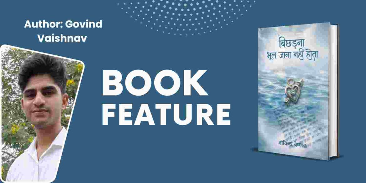
- Title: bichhadana bhool jaana nahi hota
- Author: govind vaishnav
- ISBN: 978-93-7900-440-6
- Publisher: inksight Publishing
“When Separation Becomes Memory: Designing Emotion in ‘Bichhadna Bhool Jana Nahi Hota’”
Some books tell a story. Others quietly build a world you step into. Bichhadna Bhool Jana Nahi Hota belongs firmly to the latter. At first glance, it presents itself as a tender love story rooted in memory and longing. But look closer—at its cover, its typography, its pacing—and you begin to see something more deliberate. This is a book where design is not decoration; it is meaning. Every visual and structural choice reflects the emotional architecture the author, Govind Vaishnav, is trying to build.
The title itself is a paradox. Separation is usually associated with forgetting, with closure. Yet here, it insists on the opposite—that to part ways is not to erase. That idea echoes through the cover design. There is restraint. No visual clutter. No dramatic imagery competing for attention. Instead, the simplicity draws you inward, almost asking you to pause before entering. It mirrors the emotional stillness that often follows separation—the kind that lingers long after the moment has passed.
The typography plays a crucial role here. The choice of clean, readable Hindi fonts suggests accessibility, but also intimacy. It does not attempt to impress; it aims to connect. The spacing, the alignment, even the breathing room around the title—everything feels intentional. It allows the reader to approach the story gently, without being overwhelmed. This is not a loud book. It speaks in a quiet, persistent voice.
The experience deepens. The interior layout follows a minimalist philosophy, but not in a sterile way. It feels lived-in. The chapter openings are not overly stylized, yet they carry a sense of pause—as if each new section is inviting reflection rather than urgency. The use of white space is particularly striking. It slows you down. It creates moments where the reader is not just consuming text, but sitting with it.
The opening pages set the tone beautifully. Before the narrative even begins, there is a sense of emotional framing—through dedications, short reflections, and carefully placed introductory lines. These are not filler elements. They act as emotional anchors. They tell you what kind of reading experience to expect: one that is introspective, layered, and deeply personal.
And then comes the story itself.
Set against the backdrop of a quiet village in the Malwa region, the narrative begins with a sense of stillness. The descriptions are detailed but never heavy. You can see the fields, the pathways, the rhythm of daily life. But more importantly, you can feel the undercurrent—the subtle shifts of growing up, the unspoken tensions, the quiet beginnings of emotion. The design supports this storytelling. The text is spaced in a way that allows these moments to breathe. Paragraphs do not crowd each other. The pacing feels natural, almost like memory unfolding rather than events being narrated.
This is where the author’s personal brand becomes visible.
Govind Vaishnav is not trying to be flamboyant. His writing—and by extension, the book’s design—leans into sincerity. There is a clear intention to make the reader feel seen. The themes of memory, unspoken love, and emotional transition are not presented as grand, dramatic arcs. Instead, they are woven into everyday moments. A glance. A pause. A hesitation. The design reflects this philosophy by avoiding excess. It trusts the reader to notice the small things.
One of the most compelling aspects of the book is how it treats silence. In many contemporary works, silence is often rushed through—treated as a gap between more ‘important’ moments. Here, silence is given space. Visually and narratively. The pauses in dialogue, the reflective lines, the gentle pacing of chapters—all of it contributes to a reading experience that feels almost meditative.
This is particularly evident in the way the protagonist’s emotional journey is presented. There is no sudden declaration of love. No dramatic turning point. Instead, there is a gradual build-up—confusion, curiosity, awareness. The design complements this by maintaining consistency. There are no abrupt stylistic shifts. No jarring elements. Just a steady, immersive flow that mirrors the character’s internal world.
Another interesting design choice is the structuring of the book into phases rather than conventional chapters. This subtle shift adds depth. It suggests progression—not just of events, but of emotional states. Each phase feels like a stage in the journey, both for the character and the reader. It reinforces the idea that this is not just a story being told; it is a life being lived.
The language itself is simple, almost conversational. But that simplicity is deceptive. It carries weight. And the design respects that. There is no attempt to ‘elevate’ the text through unnecessary ornamentation. Instead, it allows the words to stand on their own. This alignment between language and layout is what makes the reading experience cohesive.
The cover copy also deserves mention. It directly addresses the reader, inviting them to see their own reflections within the story. This is not accidental. It is a strategic choice—one that aligns with the author’s broader intent. Vaishnav is not just telling his story. He is creating a space where readers can locate their own memories, their own unfinished emotions.
In many ways, this book feels like a bridge—between past and present, between memory and reality, between the author and the reader. And that bridge is built as much through design as through writing.
What makes this particularly effective is the consistency of vision. From the cover to the final page, there is a clear understanding of what the book wants to be. It does not try to be everything. It does not chase trends. It stays rooted in its core emotion—and every design decision supports that.
This results in an experience that is both immersive and personal. You are not just following a narrative. You are participating in it. The design slows you down, encourages reflection, and creates space for emotional resonance. It turns reading into an act of remembering.
And perhaps that is the most powerful aspect of Bichhadna Bhool Jana Nahi Hota. It does not just tell you that separation is not forgetting. It makes you feel it—through its words, its pauses, and its carefully crafted visual language.
About the Author
Govind Vaishnav brings a thoughtful, introspective voice to contemporary Hindi literature. With a background in the corporate sector and roots in Ujjain, his writing reflects a blend of lived experience and emotional sensitivity. He draws from everyday moments—small, often overlooked instances—and transforms them into narratives that resonate deeply.
For Vaishnav, writing is not merely a craft. It is a form of reflection. A way to capture the fleeting nature of memory and emotion. His work does not rely on grand gestures or dramatic twists. Instead, it focuses on authenticity—on the quiet truths that define human relationships.
Bichhadna Bhool Jana Nahi Hota stands as a testament to this approach. It is not just a story about love and separation. It is an exploration of how we carry people within us, long after they are gone. And through both its narrative and its design, it invites readers to do the same.
Amazon: Amazon link 🔗